Research shows that having a consistent brand identity across all platforms and elements has the ability to increase revenue by 23%. In other words, it is critical to implement your brand values into every component on your site.
As a natural extension of your store, your loyalty program effortlessly enhances your brand identity. Whether you’re new to the loyalty game or not, be sure to always take a step back to assess if your loyalty program is a natural feature of your site. Is it easy to locate? Is it engaging? Does it reflect your ethos or what makes you special?
LoyaltyLion allows you to create a fully-customized and on-brand integrated loyalty program. Not only will this ensure that your loyalty program is entirely unique, but it will also give you full visibility on your site.
You can easily pick a specific destination where you can point people directly to your loyalty offering. It can be either your main navigation header or another part of your site.
In this blog, we will take a closer look at how fast-growth ecommerce stores from different industries designed their integrated loyalty program and make it a seamless part of their site. The brands are:
- Cupshe
- Waterdrop
- Lucy & Yak
- Dr. Brandt
- Pacifica Beauty
Cupshe
A swimwear and apparel brand, Cupshe, is established on ethos to “celebrate beach style”. Having millions of customers around the world, Cupshe believes life should be lived near the sea and sun.
Research shows that 68% of customers are willing to engage with a brand that shares the same values with them. With this in mind, Cupshe’s team created an integrated loyalty program called “Sunchaser Club” that enhances their brand identity and strengthens their brand community.
To increase repeat purchase and engagement, Cupshe has a tiered-based loyalty program that uses its iconic brand colors (that are associated with the sunrise and sunset) to represent different levels. The brand also reflects its unique brand values through naming its tiers Shore, Sand, Sea, and Sun.
As a result, in just three months, Cupshe increased its customer spend by 53% and repeat purchase rate by 42%.
Waterdrop
Waterdrop, a well-known micro drink brand, has created an integrated loyalty program that is highlighted on their main navigation header. Both guest visitors and members can directly see “Club” when they land on the brand’s home page.
To encourage customers to engage with the program, Waterdrop shows the rewards that can be unlocked if they become a member. On the loyalty page itself, everything, from the actions customers need to take to earn points, information on the free gifts they can acquire and the explanation of the tiers, are communicated clearly.
Waterdrop also applies its minimal branding into every single component of its integrated loyalty program page. The colors are fresh, the imagery is light and the language evokes a feeling of inclusivity. Overall, it feels like a natural part of the on-site experience.
Through their Waterdrop Club, they have seen an 80% increase in repeat purchase rates and an 84% increase in customer spend.
Lucy & Yak
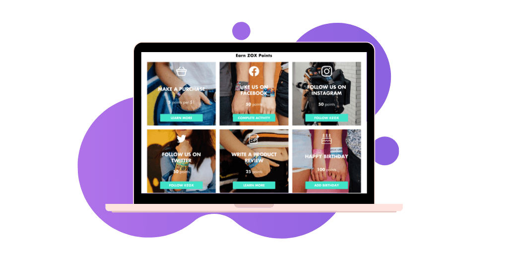
Sustainable dungarees brand, Lucy & Yak, have made their integrated loyalty page focus on their brand’s visuals. They have placed photos of customers wearing products and their lifestyle imagery behind the ways customers can earn points. This makes the pages colorful, approachable and fun to engage with. They have also named their points “Yak points” – again, another direct tie into their unique branding.
Lucy & Yak have also used their loyalty tiers in a clever way. They are named “Comfort Lover”, “Yak Enthusiast” and “Dungaree Devotee” – a humorous and light-hearted nod to their product. They have also shown how much members need to spend to move up to the next tier.
Thanks to their fully on-brand program, 34% of Lucy & Yak’s revenue now comes from their loyal customers.

Dr. Brandt
Dr. Brandt is one of the most well-known skincare brands, To make their customers feel like VIPs, they created an integrated loyalty program called “Dr. B VIP”.
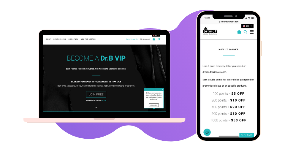
To make the program as a natural extension of the site, Dr. Brandt has advertised their integrated loyalty page in the main navigation header with the words, “Earn Rewards”.
To remain consistent with their branding, Dr. Brandt’s fully-customized loyalty program matches the site’s color scheme and modern design. Customers can easily see how the loyalty program works, how they can earn extra points and what exclusive benefits they can obtain.
As a result, Dr. Brandt had seen 70% higher AOV and 77% higher customer spend by their loyalty program members compared to guest visitors.

Pacifica Beauty
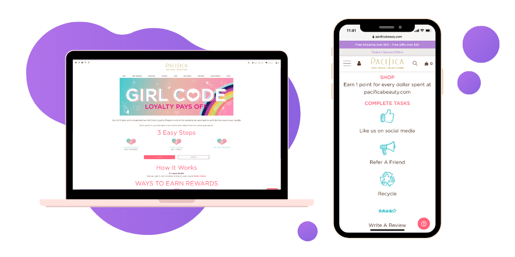
Pacifica Beauty is an excellent example of an easy-to-use and navigable loyalty page. Their aptly named program, “Girl Code Points”, blends effortlessly with the look and feel of the site. Using the same icons and color scheme, they have made sure that their program is an essential feature of their store and a natural part of the customer experience.
Pacifica Beauty also displays its loyalty program across the whole buyer’s journey. When a shopper hovers over the cart icon, they can see their point balance for the items in their cart. And, when they click to view their full cart, they are shown the point value of their order alongside how many points they still need to redeem before they can claim a free gift. This way, customers are incentivized to increase their basket size.
Now, loyalty program members spend up to 22% more than non-members and the brand has a 44% increase in repeat purchase.

Key takeaways
In this blog, you’ve seen five fast-growth ecommerce stores with different brand values and across industries. However, while they were designing an integrated loyalty program, they all followed a similar approach:
- They implemented their brand values and identity into their integrated loyalty programs
- Used their brand values in their tiers to encourage customers to repeat purchase
- Incorporated their brand colors into the page
- Explained how their loyalty program works and how customers can earn extra points
If you want to find out more about Integrated Loyalty Program and how to set your store apart, check out more information here or book a demo.


